Primary KPI
Download button taps per page visit
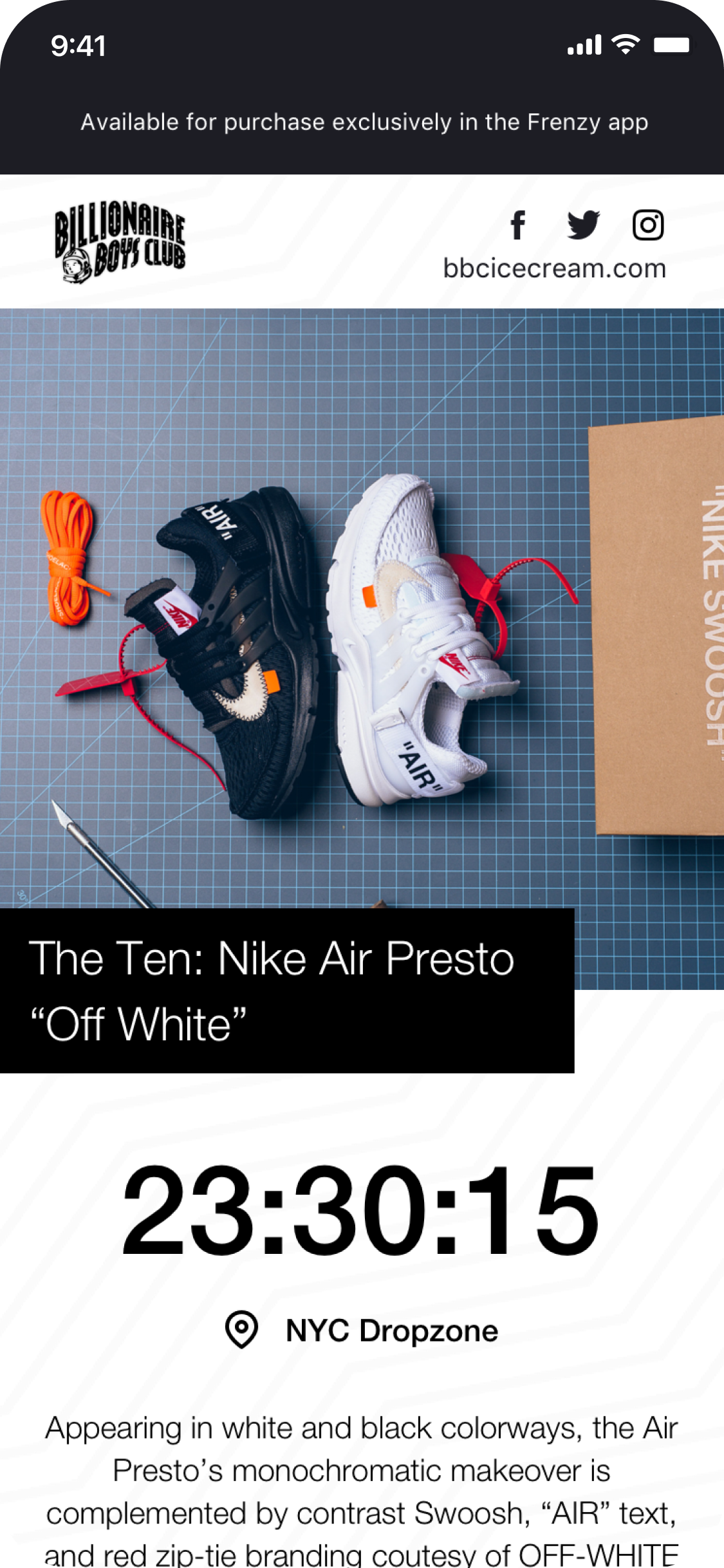
Frenzy is Shopify's flash sale app used by top streetwear brands. I designed the product page Shopify merchants use to announce streetwear drops.
The product page is a preview of a product advertised by merchants on social media, typically showcasing limited and high-demand streetwear products.
To scope the problems with the existing solution, I collected feedback from the brands on the platform, first time buyers, and fellow team members.
The product page lacks information buyers need and is difficult to skim through.
The product page looks outdated and boring. Merchants don't want their products showcased like this.
The product page can harm user trust with the company and has no resemblance to the Frenzy mobile app.
Increase conversion rates by engaging visitors and showing them all the important information of the sale.
Primary KPI
Download button taps per page visit
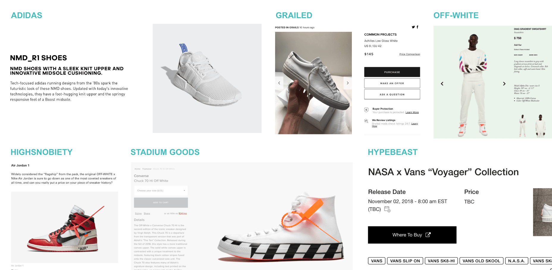
To gain a better understanding of the branding and architecture of sneaker/streetwear product pages, I explored the websites of Adidas, Nike, as well as multiple high-fashion streetwear brands.

Sneaker and streetwear brands use Frenzy by first creating a Frenzy sale through their Shopify account. After the sale has been approved, the link to the product page for their sale is provided, and the merchant shares this link through social media. If the user has the Frenzy app installed, the page directly takes them to the product inside Frenzy. On the other hand, those without the app installed see the product page, designed to be a preview of the product that leads users to the app. For this reason, the product page is the most important funnel for user acquisition.
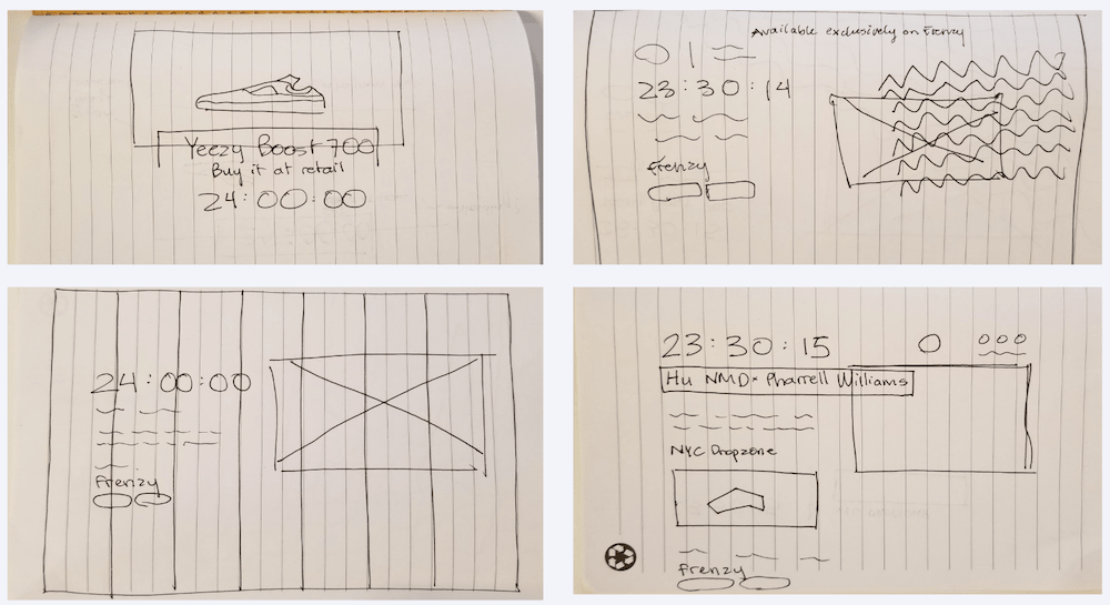
From my initial sketching, I narrowed the design options down to three main concepts. The first (top left) takes advantage of a large hero image used to capture the user's attention. As merchants choose the best photos to showcase their products, highlighting the product image was an important consideration during the design process.
The second design option (top right) focused on emphasizing Frenzy branding with its wavy line pattern, creating strong visual ties with the page and the mobile app.
Finally, the third option (bottom left and bottom right) focused on balancing emphasizing the value proposition of the Frenzy app with the branding and content of the merchant. In the end, elements of all of these wireframes were used to create the final designs.
The product image grabs the user's attention and clearly indicates what product is available for purchase, but it also hides the CTA below the fold. For users who want to purchase or view the product in the app, this hero image makes it harder to find where to go through the checkout flow.
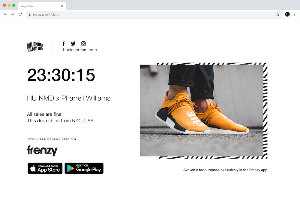
This option puts an emphasis on keeping the download button clearly visible to help users go through the checkout flow faster. Users with context from social media posts can quickly find the link, while those who aren't exactly sure what Frenzy is can get a sense of the app before committing to download it.
Option 3 was selected for the final designs as the content is easily skimmable and left aligned. The countdown and product name are displayed prominently, drawing attention to the details of the product and next steps to purchase.
View all final designs
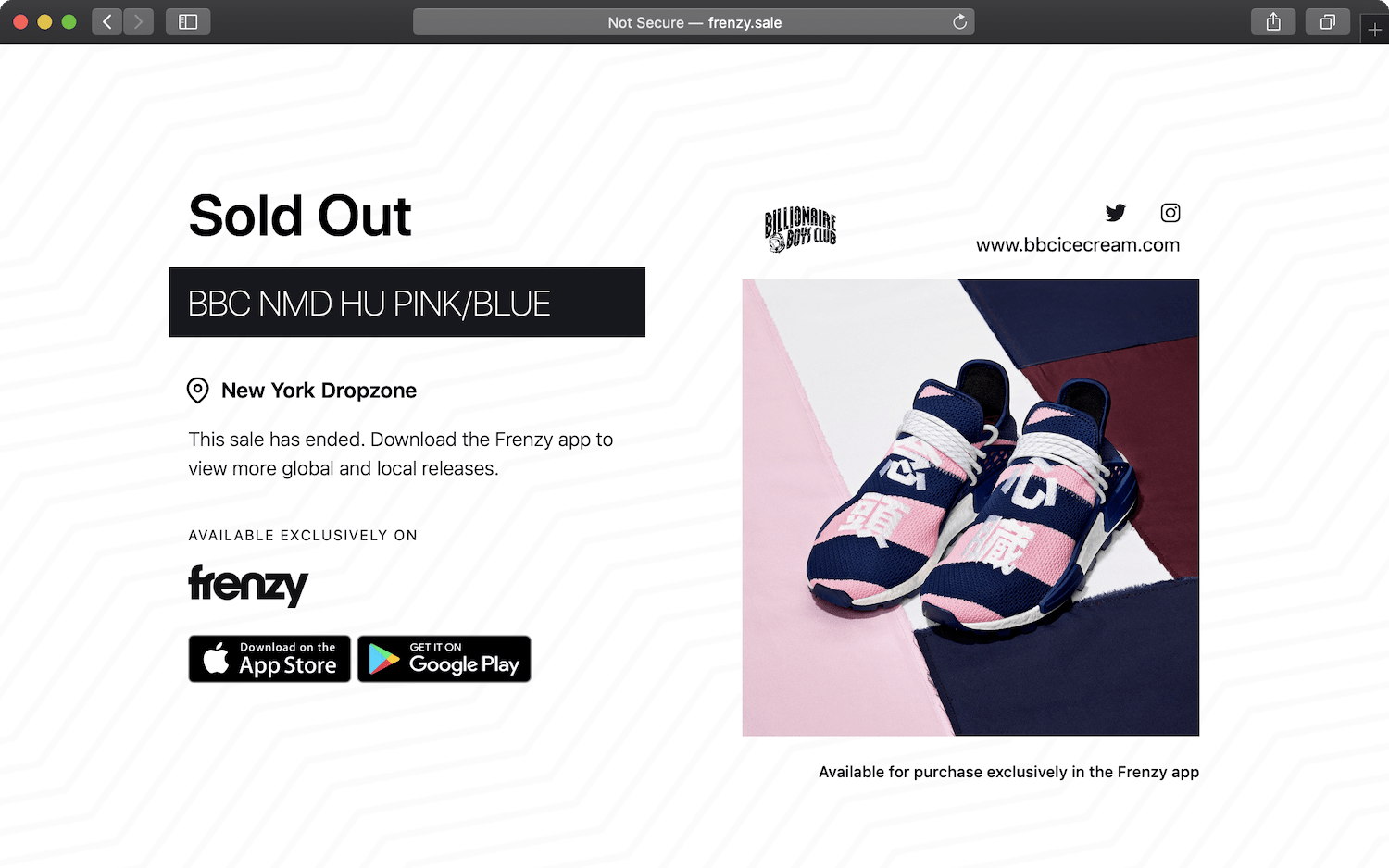
The redesigned product page is shipped is now live. The screenshot below is from when Billionaire Boys Club dropped Pharrell's new Human Race NMDs!
Conversion rate increase of over 10% from new page visits
Played key role in driving Frenzy into top 10 in the App Store for Shopping category (from the top 100)
Exceedingly positive feedback from merchants and increased activity from social media shares
