Key Insight
New users have low intent when creating their accounts
At Quora, I designed a trending page to help users discover content.
Quora is a Q&A platform with the mission of sharing and growing the world's knowledge. During the summer of 2019, I interned as a product designer on the internationalization team.
One of my first projects at Quora was to explore the process of how new users encounter Quora and identify points where dropoff occurs. I started by documenting each step of the signup and onboarding flow. I also met with user researchers, data scientists, and other product designers at the company to learn from their collective experiences. With this information, I created a lifecycle diagram illustrating the most common flows of new users.
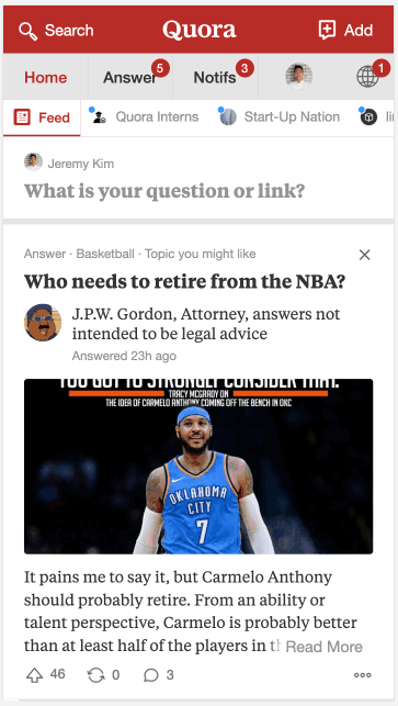
There are two main ways new users sign up for Quora: we referred to these as SEO and organic. The SEO (search engine optimization) flow generally involves people making a Google search and then clicking a Quora link in the search results. While the user can read content on the link they clicked, they must create an account or sign in to view related questions. This signup wall often leads to frustration and low intent when new users create their accounts as many simply want to view the link they had just clicked on. As this SEO flow accounted for the majority of new users on the platform, new users often created accounts which quickly became stale.
Key Insight
New users have low intent when creating their accounts
In order for users to get the most out of Quora and find content that matches their interests, they must complete the onboarding flow and follow topics. As these users often have low intent when going through the onboarding steps, a majority of these new users follow the minimum number of topics and don't accurately select what interests them. This leads to two main problems—users end up with a home feed of content they don't care for, or only see content that is far too specific to a particular topic.
Problem 1
New user feeds are too siloed around particular topics
Problem 2
Low intent follow actions lead to a cluttered home feed
At the core of the two problems is the question: how do users discover new content sources after they sign up? Content sources on Quora refer to topics, spaces (Quora's version of a subreddit or Facebook group), and other users who post and like content.
Key Question
How do users discover new content sources?
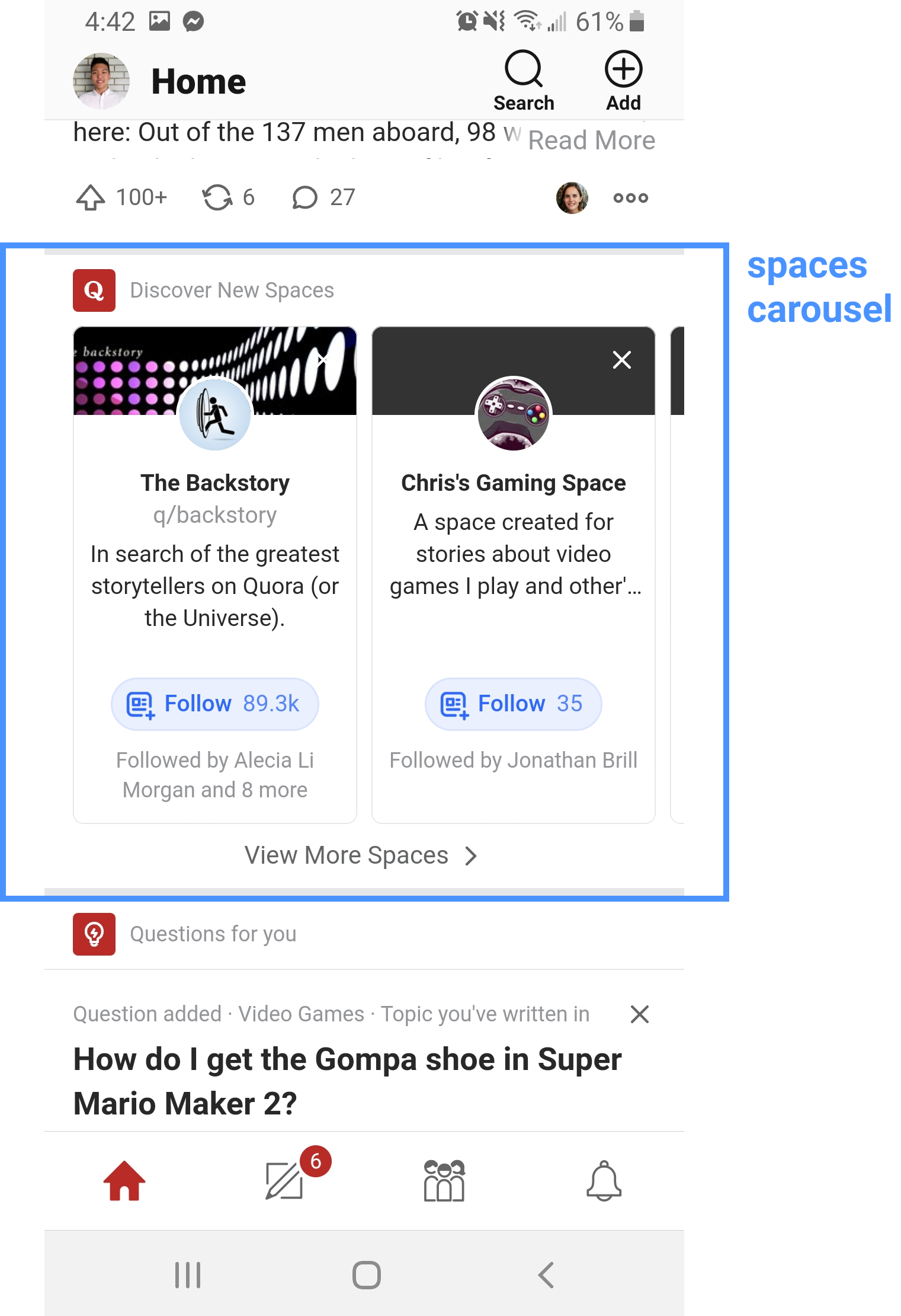
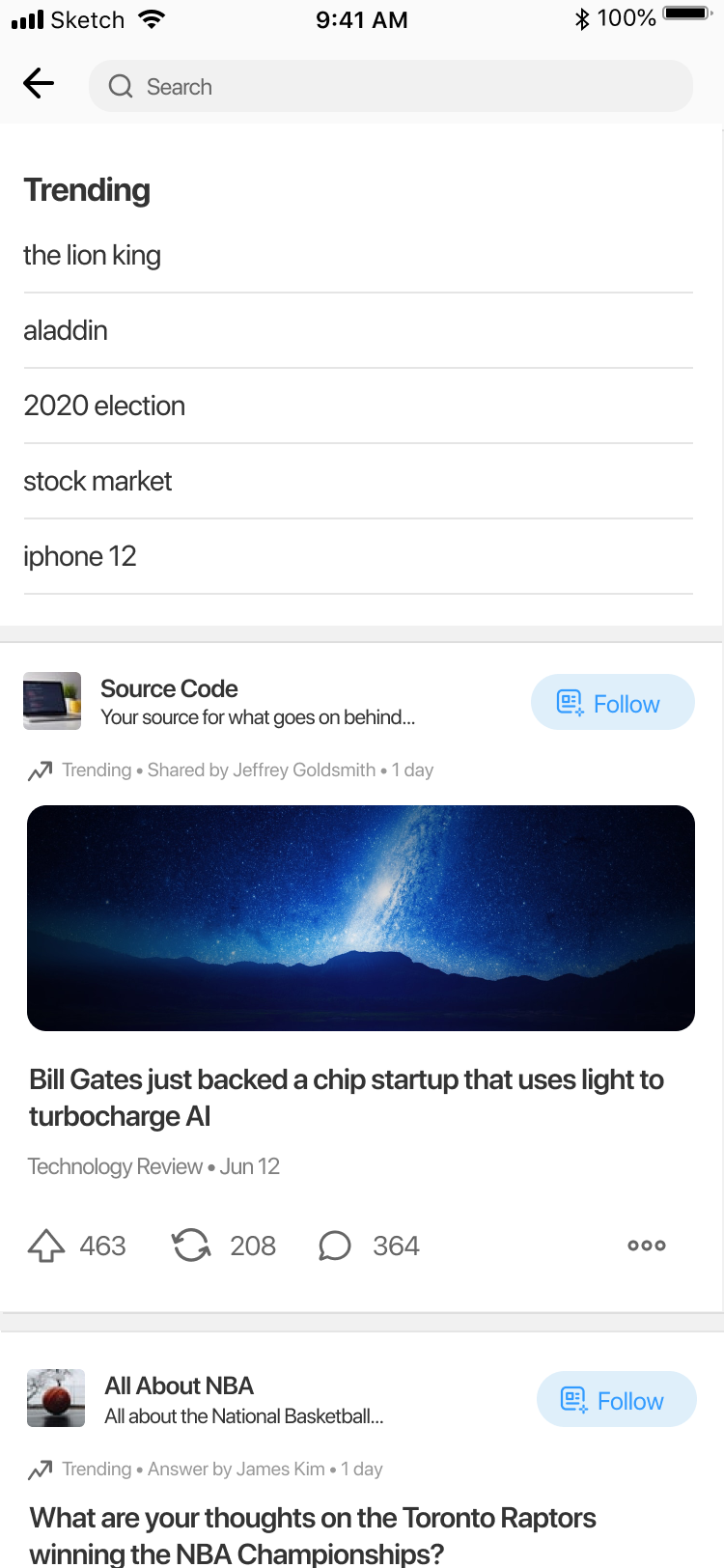
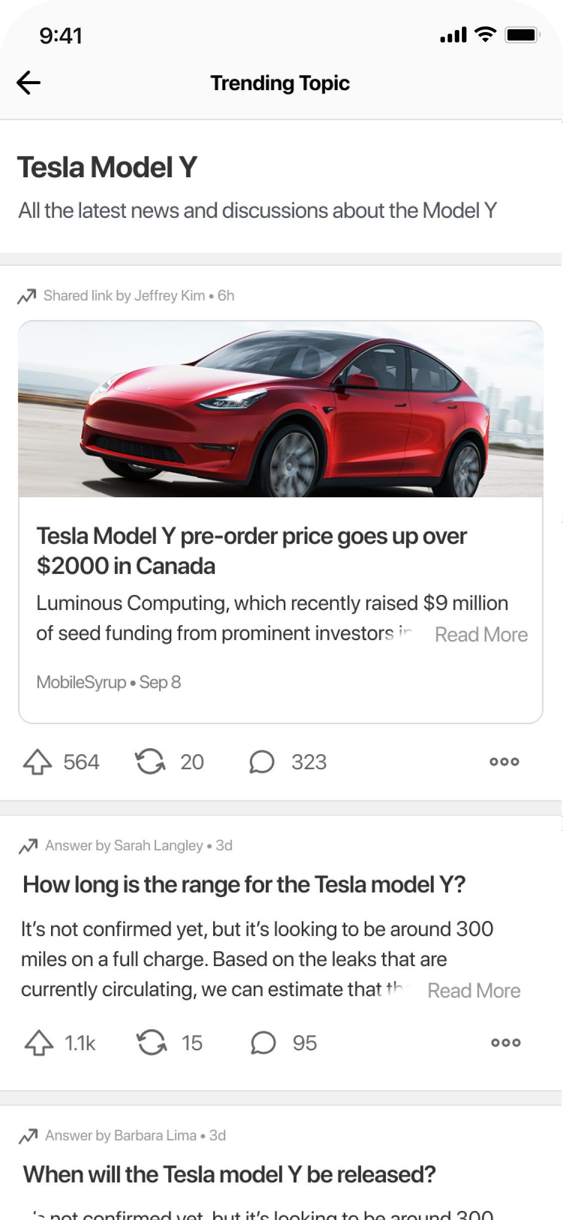
One of the main ways users find new topics and spaces to follow is through discovery carousels which are placed in the home feed.
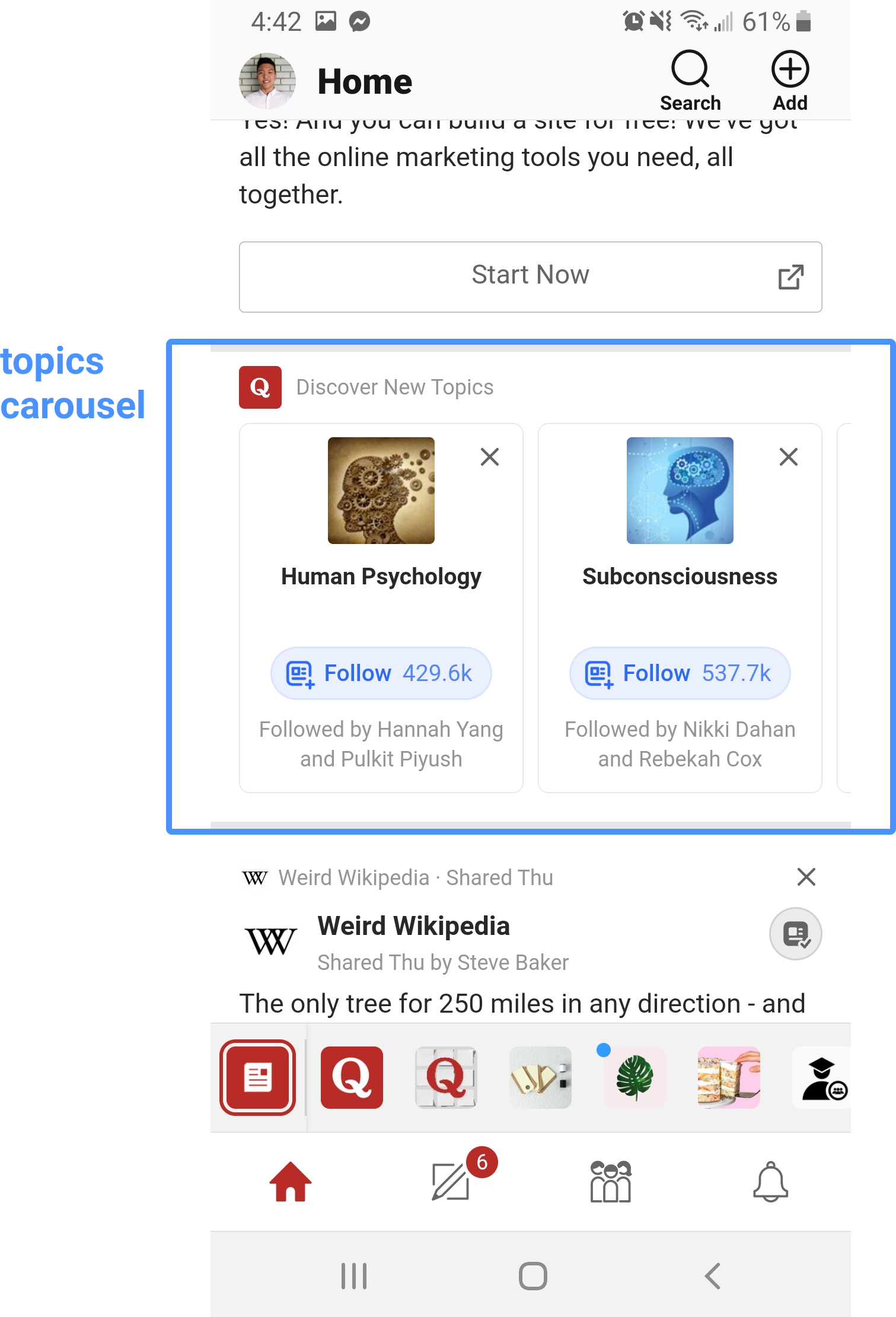
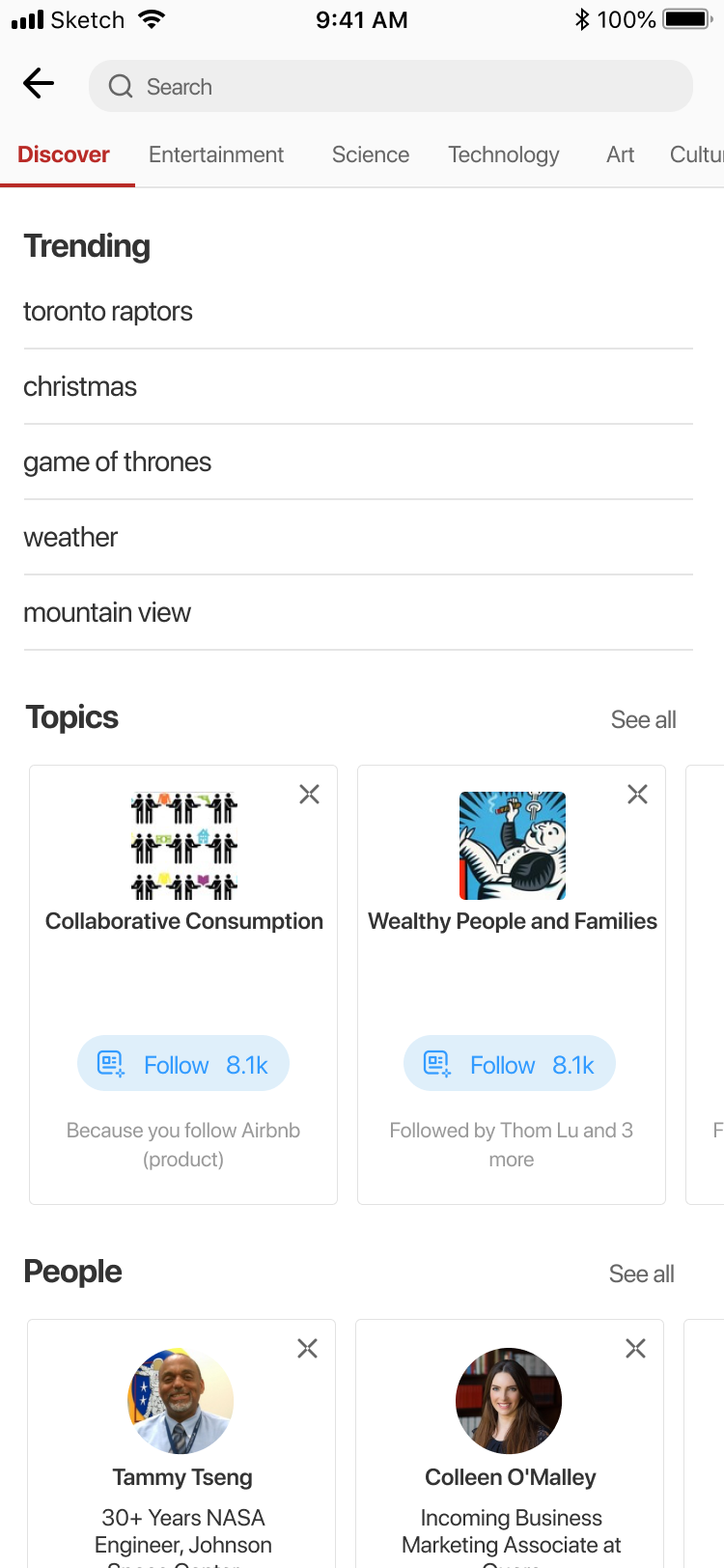
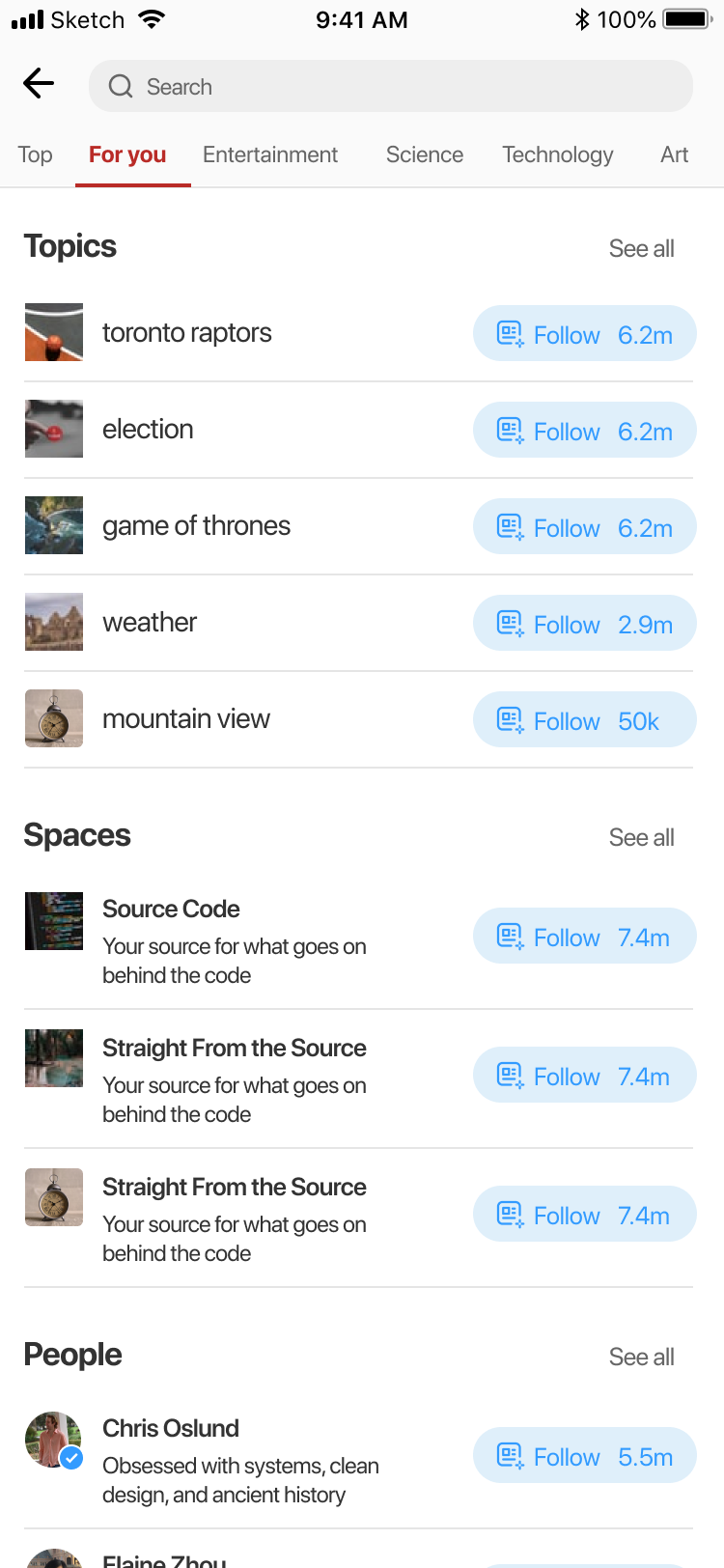
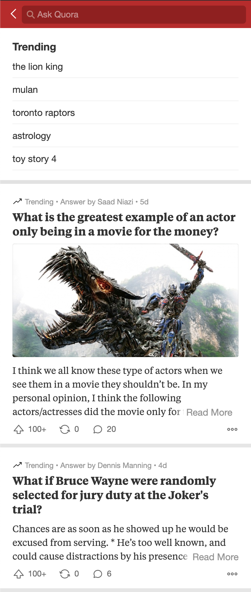
Users also directly search for specific topics, spaces, and users. However, unlike similar applications such as Twitter or LinkedIn, Quora's search page is initially empty.
While similar applications use the search page as a way to surface new content, Quora's search page is empty
Quora
Improve the discoverability of quality content sources through redesigning the mobile search page.
Priority Metrics and KPIs
Active hours (sessions per day), trending content taps, topic and space follows
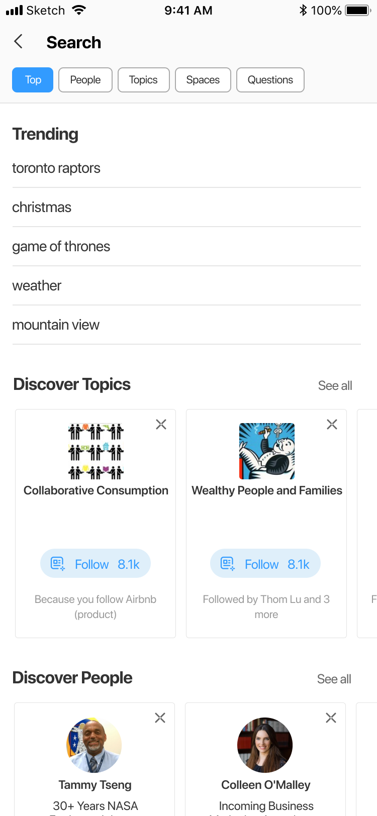
The first approach focuses on grouping the discovery carousels in one place, allowing users to easily find new topics, spaces, and users to follow. While having a dedicated page for the carousels may increase the number of content sources a user follows, simply showing suggestions of content sources to follow isn't valuable for users. For this reason, approach #2 focuses more on surfacing actual content that the user may be interested in.
People don't necessarily want to follow more content sources— they to want to see better content when they use Quora
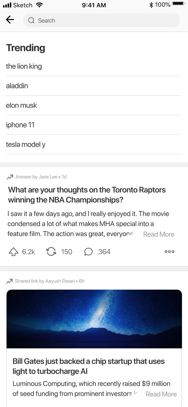
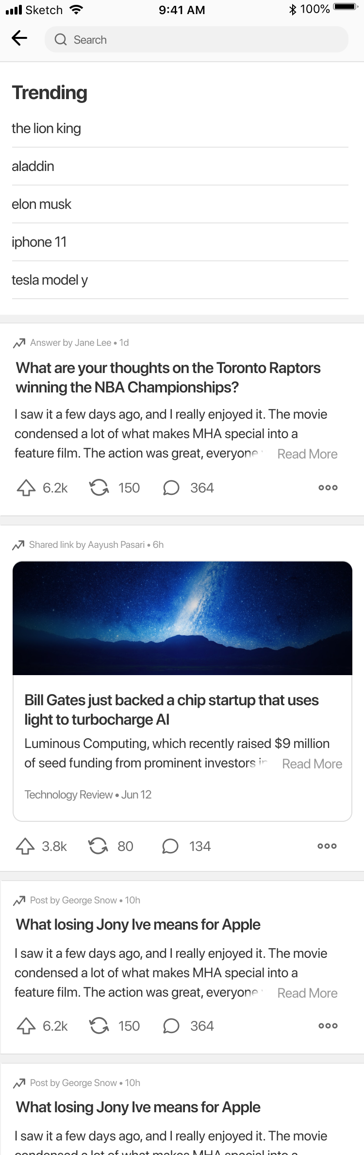
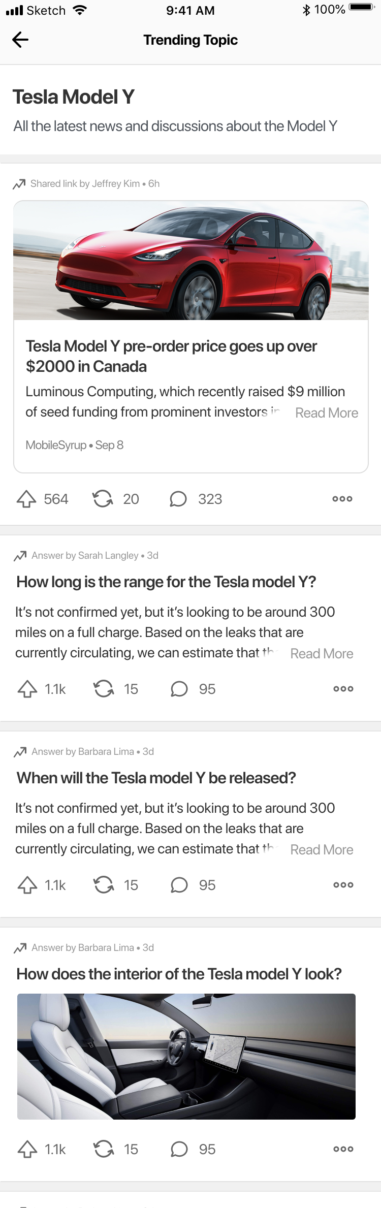
The second approach I tried was to create a separate feed where users can find content that may not have entered their home feed. The idea with showing trending content is that users can first see the stories (question and answer pair) related to a particular content source before actually following that source.
Showing trending content lets users view engaging stories before following the content sources
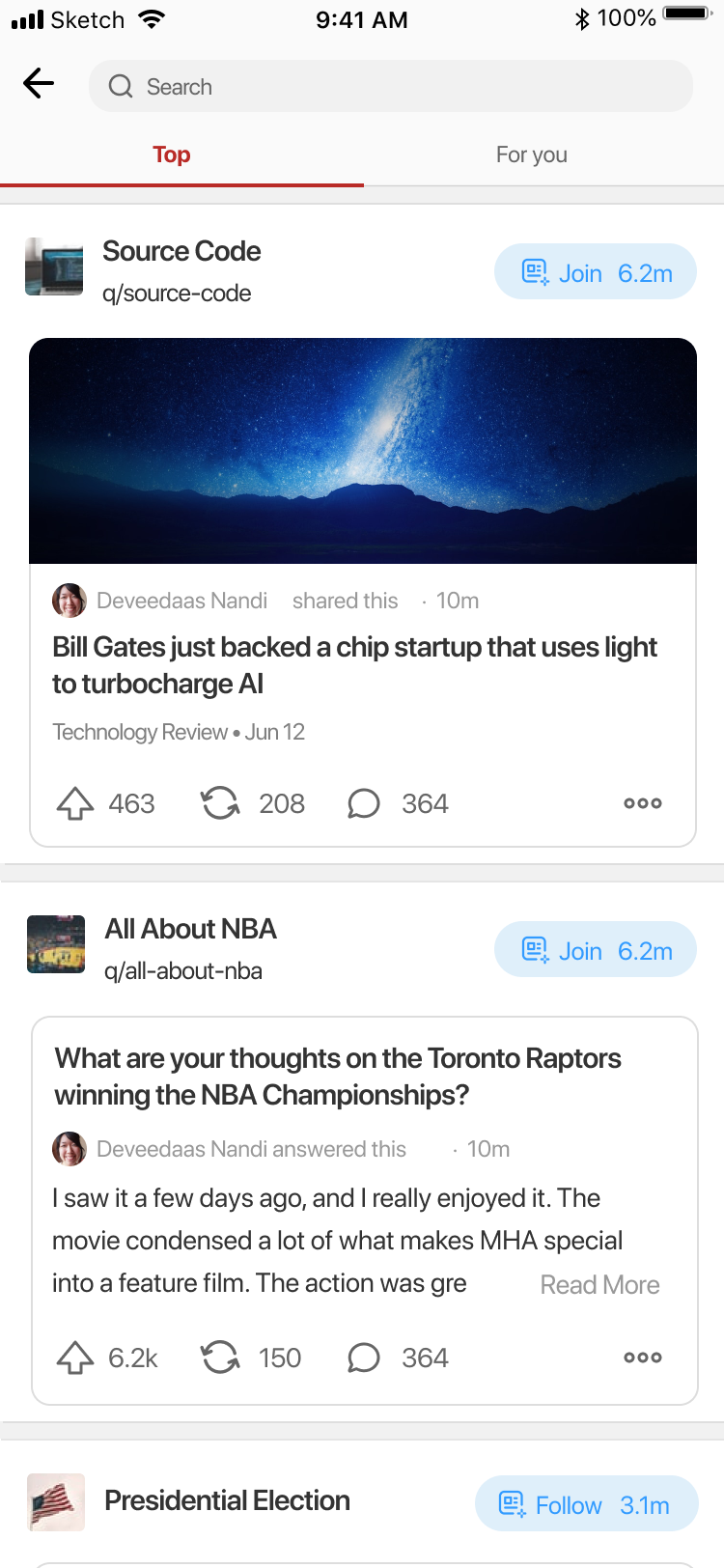
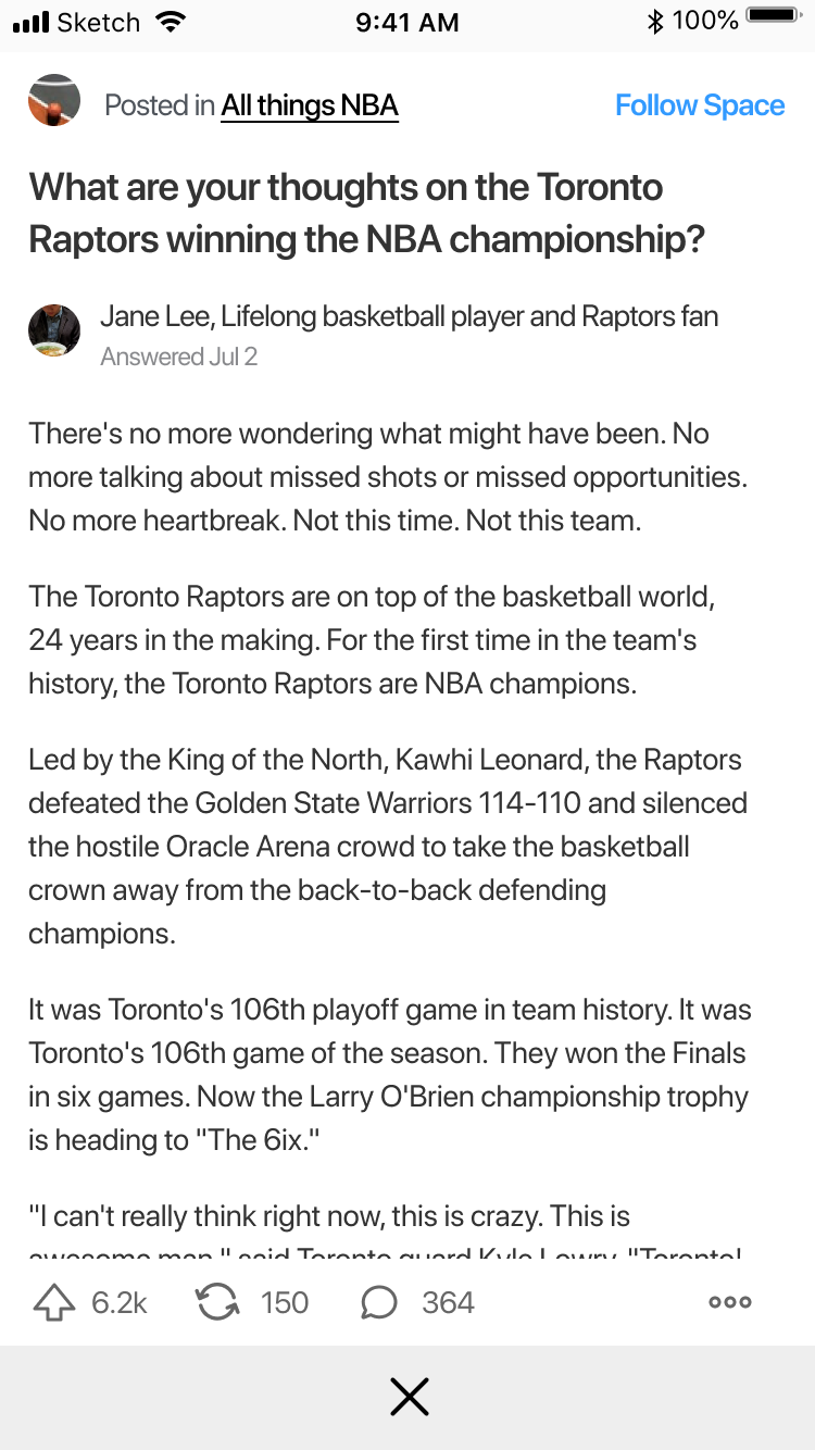
The first step to designing the trending feed is thinking through how each story (question and answer pair) will be presented. Since there's a limited amount of space on the screen especially if they keyboard is up, I designed the trending card to take less vertical space by moving the author information to the top and removing their picture/credential. As the purpose of the explore page is to highlight new content, moving the author information puts the focus back to the questions and answers.
The trending card is 22% shorter than the home feed card, allowing more stories to be shown in the limited available space

Another important consideration was deciding whether to open the keyboard when the user taps the search icon from the home page. On one hand, showing the full page without the keyboard would likely increase engagement with the new trending content feature with the tradeoff of requiring an extra tap to enter a search query. The other option of showing the keyboard right away aligns with the intent of users looking to enter a query, however reduces potential interaction with the new trending feed.
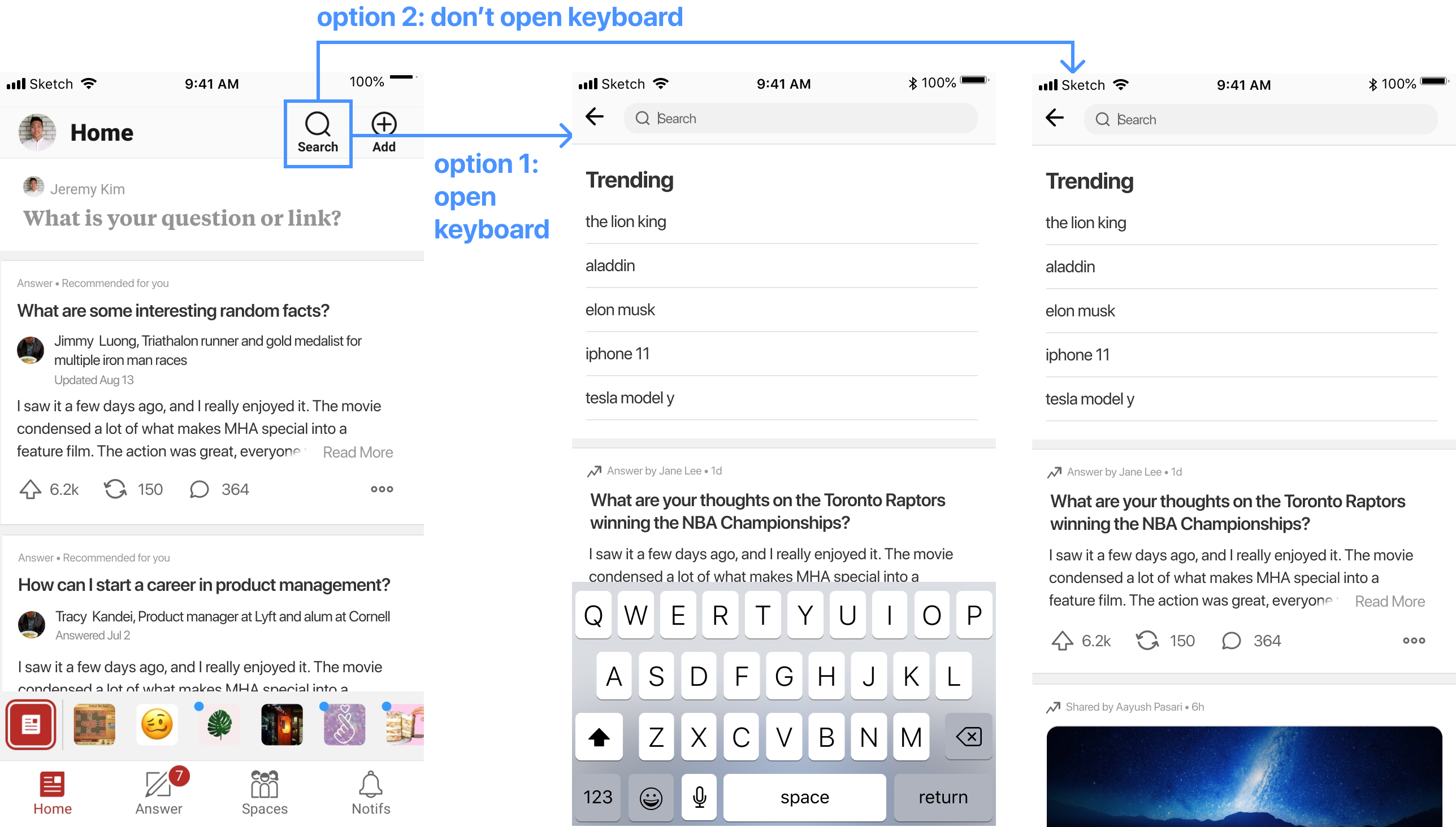
After discussion with the team as well as looking at data of search usage, we decided to go with option 1 (open the keyboard immediately). This way, the trending content is still visible when opening the search page, however does not interupt those who want to enter a search right away.
We chose option 1 to ensure the new feature doesn't hinder those who simply want to make a search
The explore page gives users a way to break out of their home feed and discover new content that matches their interests. With the trending topics, users can view a curated list of related stories while also being able to read globally trending content on the platform.
View Figma Prototype
In order to produce a more realistic prototype and assess the engineering work required to build this feature, I developed a working prototype during Quora's internal hackathon using the company's web framework (Python + Webnode). The logic behind the ranking algorithm of stories was built by two engineers and two data scientists I was working with.
After developing the prototype above, our team won the company's internal hackathon, sparking an initiative to build this feature with a larger engineering team dedicated to it.
The prototype won first place in company hackathon
The trending/explore page project is now being prioritized and the team is currently building the first version